How to Create Custom Bullet Points in Webflow Rich Text
Custom bullet points can be a nice touch to further incorporate branding into your content, but they’re a bit tricky to implement in Webflow. In this article, we’ll provide code you can easily copy and paste into your site, along with steps to implement and update the code for your specific styling needs.
Simple Bullet Point Styling
If you’re only looking to make simple styling changes to the bullet points, you may be able to use the ::marker CSS pseudo element to add the styling.
For example, you can change the color and size of the bullet points by adding the code below to the Inside <head> tag field in the Page Settings.
<style>

li::marker {
  color: green;
  font-size: 2rem;
}

</style>
Or you can replace the bullet point with an emoji using the code below:
<style>

li::marker {
  content: '👉';
}

</style>
The ::marker pseudo element supports the properties below:
- All font properties
- The
white-spaceproperty colortext-combine-upright,unicode-bidi, anddirectionproperties- The
contentproperty - All animation and transition properties
You can find the full documentation for using the ::marker pseudo element at MDN Web Docs.
Fully Custom Bullet Points
To add fully custom bullet points in Webflow, you can replace the default bullet point entirely with your own image.
Step 1: Upload the asset for your bullet point
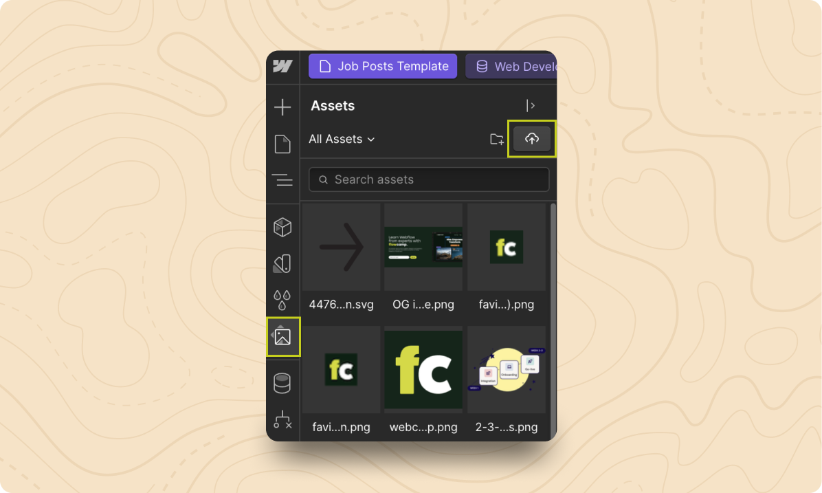
From the Designer, open the Assets panel and upload the image or svg you’d like to use as your bullet point.

Step 2: Paste CSS inside the <head> tag of the page
Navigate to the page you’d like to implement custom bullet points on, then open the page settings.
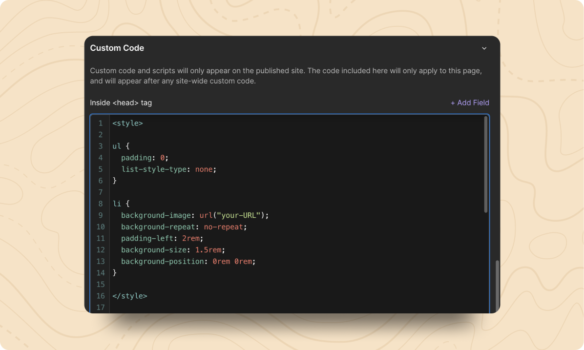
Open the page settings, then paste the CSS below into the Inside <head> tag field.
<style>

ul {
  padding: 0;
  list-style-type: none;
}

li {
  background-image: url("your-URL");
  background-repeat: no-repeat;
  padding-left: 2rem;
  background-size: 1.5rem;
  background-position: 0rem 0rem;
}

</style>

Step 3: Add your asset URL in the background image property
Replace the your-URL text in the background-image property with the URL for the asset you uploaded to Assets panel in Step 1.
To get the link to your asset, open the Assets panel, then hover over the asset and select the link icon to copy the link.

The final code for the background-image property should look something like this:

Step 4: Adjust the CSS properties to fit your needs
UL Padding
By default, the padding property is set to remove all padding around the unordered list elements on the page. If you need to add padding around the overall list, you can update this property. If you’re looking to indent the list items, you’ll update the padding-left property on the list item (li) elements instead.
List-Style-Type
Having the list-style-type property set to none removes the default bullet point asset, this property should be left as is for the code to work.
Background-Repeat
You’ll most likely always want to keep this property set to no-repeat as it is in the default code from Step 2. This property stops the asset you uploaded for your custom bullet point from being repeated multiple times to fill space, so it shows up just as you uploaded it.
Padding-Left
This property controls the spacing to the left of the list items. You can increase it to have the bulleted list appear more indented or decrease it reduce the indent.
Background-Size
The background-size property sets the width and height of image you uploaded as your bullet point. In the code copied above, the single value that follows background-size sets the width of the element, and the height is automatically set to keep the dimensions of the uploaded asset. If you’d like to set both the height and the width, you can add two values (background-size: 1rem 1.5rem;), and the first value will set the width, while the second value will set the height.
Background-Position
The background-position property determines the exact placement of your custom bullet point. The first number affects the horizontal spacing, while the second sets the vertical spacing.
We hope this article has helped you with implementing custom bullet points in Webflow. If you liked this article, then please subscribe to our newsletter or follow us on X.
.svg)


